Brand Guidelines
Our Brand Identity
These guidelines define the visual and verbal identity of Shuraka Almustaqbal. They exist to ensure our brand is expressed consistently, confidently, and authentically across every touchpoint.
2026 Edition
01 — Brand Strategy
Who We Are
Shuraka Almustaqbal is a business solutions and consulting firm dedicated to developing sustainable growth strategies for its partners. Our brand reflects our commitment to innovation, integrity, and lasting impact.
Vision
To extend our collective knowledge to dynamic and innovative business partners.
Mission
To develop sustainable solutions and ensure growth through the success of our partners' achievements.
Strategy
To work closely with our partners in developing strategies tailored to shared business aspirations and goals.
Our Values
What Drives Us
Passion
We are passionate in providing game-changing solutions for our partners.
Innovation
We push the limits against the status quo, innovating creative and dynamic strategies.
Integrity
We deliver our solutions with honesty, transparency, and consistency.
Commitment
We are committed to the personal and professional development of our people.
Brand Tagline
"Your Partner in Sustainable Growth"
02 — Logo System
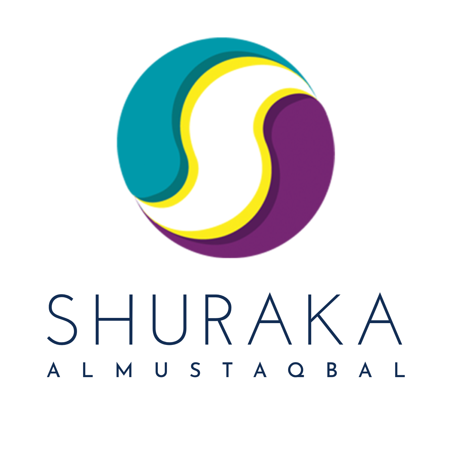
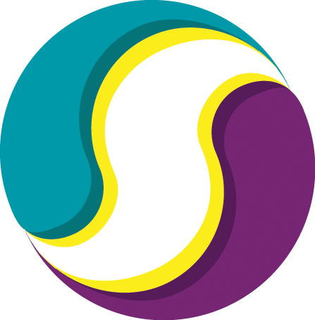
Main Logo
The Shuraka Almustaqbal main logo combines the iconic S-mark symbol with the wordmark "SHURAKA ALMUSTAQBAL". The symbol represents partnership, continuity, and forward momentum — two flowing forms unified within a circle, rendered in the brand's signature teal, yellow, and purple.
Horizontal Layout
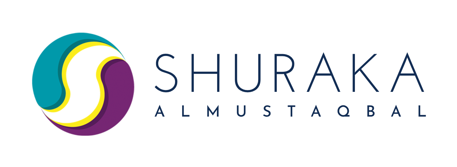
Full Colour
Use on white or light backgrounds

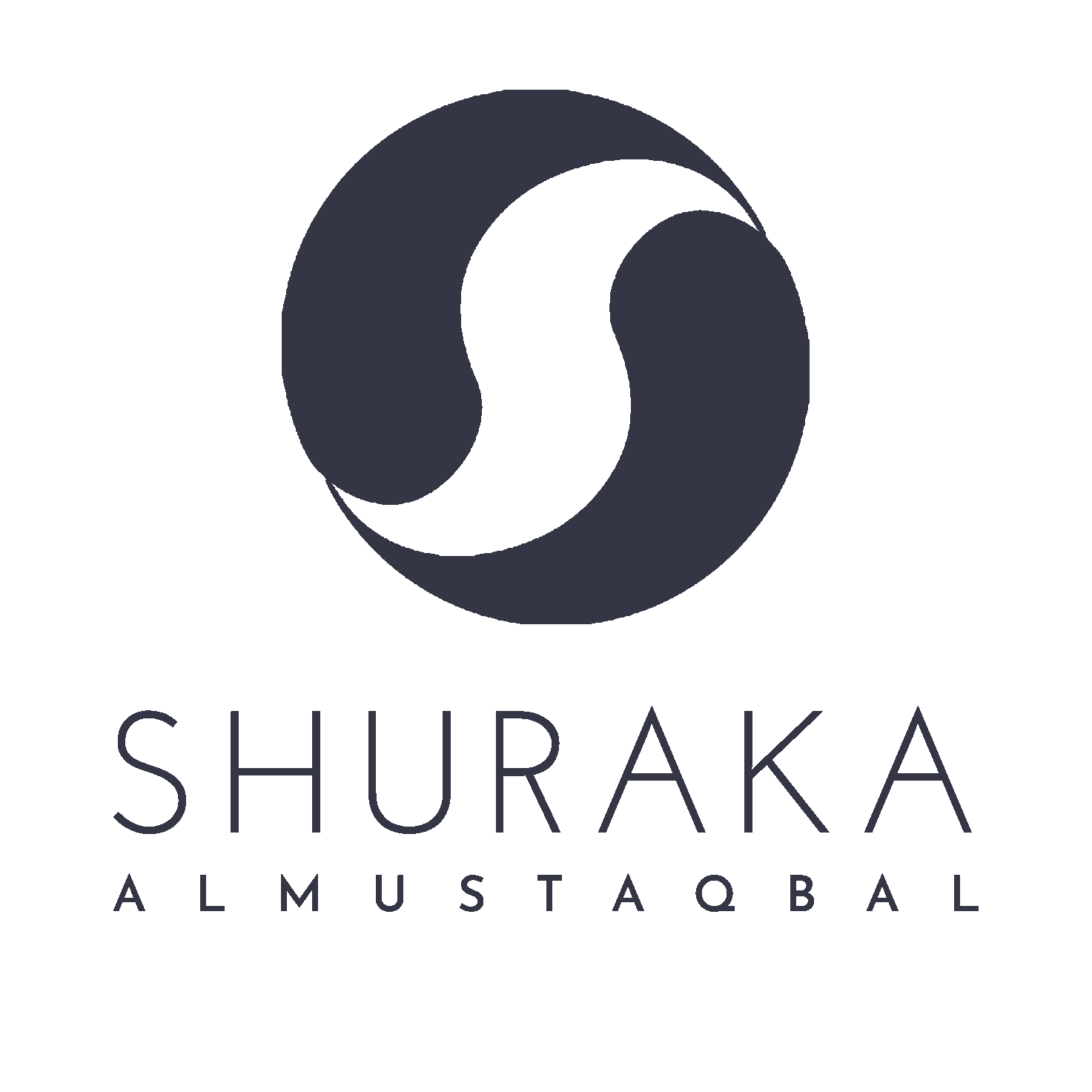
Dark / Black
Use on white or light backgrounds
Negative (White)
Use on dark backgrounds
Stacked / Vertical Layout
Full Colour — Stacked
Use on white or light backgrounds
Dark — Stacked
Use on white or light backgrounds
Negative — Stacked
Use on dark backgrounds
Symbol / Icon Only
Full Colour
Negative
The symbol-only version is reserved for use as an app icon, favicon, social media profile image, or where space constraints prevent the full wordmark from being legible.
03 — Sub-Brand Logos
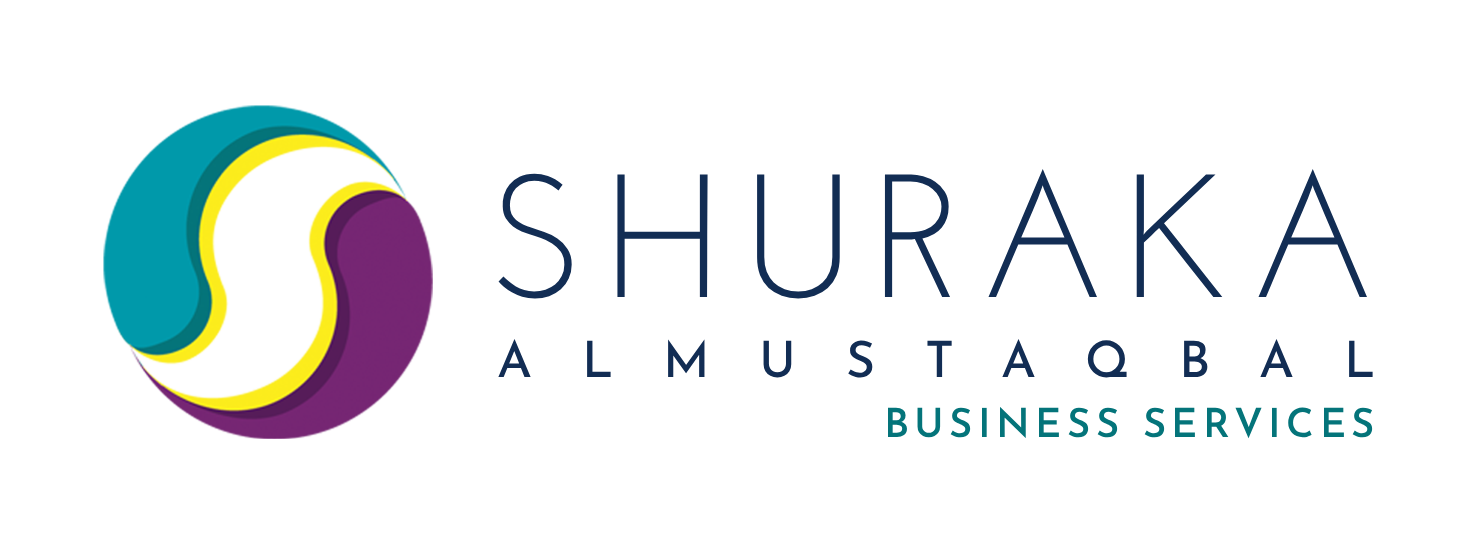
Business Services Logo
The Business Services logo extends the main identity with the "BUSINESS SERVICES" descriptor set in teal — reinforcing the professional, growth-oriented nature of this division. It is used exclusively for all Business Services communications and collateral.
Full Colour
Use on white or light backgrounds

Dark / Black
Use on white or light backgrounds
Negative (White)
Use on dark backgrounds
On Teal Background
Acceptable on brand teal
On Dark Teal Background
Acceptable on deep teal
Sub-Brand Note
The Business Services logo must never be used in place of the main Shuraka Almustaqbal logo. It is specific to the Business Services division and should only appear in contexts directly related to business consulting, strategy, and corporate services.
04 — Sub-Brand Logos
Training Center Logo
The Training Center logo uses the same S-mark with the "TRAINING CENTER" descriptor set in purple — distinguishing this division's focus on human capital development, learning, and professional growth.
Full Colour
Use on white or light backgrounds

Dark / Black
Use on white or light backgrounds
Negative (White)
Use on dark backgrounds
On Purple Background
Acceptable on brand purple
On Deep Purple Background
Acceptable on deep purple
Sub-Brand Note
The Training Center logo is specific to the Training Center division and should only appear in training-related materials, course collateral, certificates, and learning platform interfaces. It must not be used as a substitute for the main brand logo.
05 — Logo Usage
Logo Usage Rules
The logo is the most recognisable element of our brand. Consistent, correct usage protects the integrity of the Shuraka identity. Follow these rules carefully.
Clear Space
Always maintain a minimum clear space equal to half the height of the "S" symbol around all sides of the logo. This ensures legibility and visual breathing room in all applications.
Minimum Size
120px
Digital minimum
Horizontal
80px
Print minimum
30mm wide
40px
Icon minimum
Symbol only
32px
Favicon
32×32px
Do's & Don'ts
Use the full-colour logo on white or light neutral backgrounds.
Use the negative (white) logo on dark or brand-coloured backgrounds.
Use the dark logo version on light-coloured or photographic backgrounds.
Do not stretch or distort the logo in any direction.
Do not rotate or tilt the logo.
Do not apply drop shadows, outlines, or effects to the logo.
Do not place the full-colour logo on a busy or low-contrast background.
Do not recreate, redraw, or alter the logo's colours.
Do not use the logo at sizes smaller than the minimum specified.
Co-Branding with Partner Logos
When Shuraka Almustaqbal appears alongside a partner's logo, follow these rules to maintain brand integrity and ensure both identities are presented with equal respect.
- —Place logos side by side with a thin vertical rule separator.
- —Ensure both logos are of equal visual weight and size.
- —Use the full-colour Shuraka logo on white or light backgrounds.
- —Maintain the minimum clear space (½X) around the Shuraka logo.
- —Use the negative (white) Shuraka logo when the background is dark.
- —Do not overlap or crowd the Shuraka logo with the partner logo.
- —Do not resize Shuraka's logo to be smaller than the partner's.
- —Do not place both logos on a busy or patterned background.
- —Do not combine the Shuraka wordmark with another brand's symbol.
- —Do not use sub-brand logos (Business Services / Training Center) in place of the main logo for co-branded materials unless the partnership is division-specific.
Approval Required
All co-branded materials must be approved by the Shuraka brand team before production or publication.
Colour Backgrounds
When using a partner's brand colour as a background, ensure the appropriate Shuraka logo variant (negative or dark) is used for legibility.
Digital Co-Branding
For digital co-branded assets, use the horizontal Shuraka logo. The stacked version is only acceptable when space is severely constrained.
06 — Logo Downloads
Download Logo Assets
All logo files are provided as high-resolution PNG files (5892 × 2160 px for horizontal logos; 5892 × 5892 px for stacked) with transparent backgrounds — suitable for print applications up to A0 size at 150 DPI. Always use the correct variant for each application as described in the Logo Usage section.
Social Media Profile Image
Square Profile Icon
The brand icon (favicon) is the approved image for all social media profile pictures. It is provided in square format and is compatible with Instagram, LinkedIn, X (Twitter), Facebook, and all other platforms. Upload at the highest resolution available.
Recommended upload size: 1000 × 1000 px minimum | Format: PNG
Square · Transparent BG
Main Logo — Horizontal
Main Logo — Stacked
Business Services Logo
Training Center Logo
Icon / Favicon
Brand Icon (Favicon)
PNG · 1788 × 1816 px · Transparent BG
Usage Note
These files are for approved use only. Do not modify, recreate, or redistribute logo files without written authorisation from the Shuraka Almustaqbal brand team. All PNG files are high-resolution (5892 px wide) and suitable for large-format print. For original source files (AI, EPS), contact [email protected].
06 — Colour Palette
Brand Colours
Our colour palette is drawn directly from the brand mark. Each colour carries specific meaning and purpose. Click any swatch to copy the hex code.
Dark Navy
Primary
Primary text, backgrounds, dark applications
Teal
Secondary
Accents, links, Business Services highlights
Deep Teal
Secondary
Hover states, deep accents, Business Services
Yellow
Accent
Highlights, energy, call-to-action accents
Purple
Accent
Training Center identity, creative accents
Deep Purple
Accent
Training Center deep tones, sophisticated accents
Colour Usage Hierarchy
Primary
Used for the majority of all brand communications. Dark Navy for text and structure; Teal for accents and highlights.
Secondary
Supporting colours that add depth and energy. Deep Teal for hover states; Yellow for high-energy accents and call-to-actions.
Sub-brand
Reserved for the Training Center sub-brand. These colours distinguish Training Center materials from Business Services.
Accessible Colour Combinations
Aa
Navy / White
PASSAa
Navy / Teal
PASSAa
White / Navy
PASSAa
Teal / White
PASSAa
Purple / White
PASSAa
Yellow / Navy
PASSAa
White / Yellow
FAILAa
Teal / Yellow
FAIL07 — Typography
Josefin Sans
Josefin Sans is the exclusive typeface of Shuraka Almustaqbal. Its geometric construction and elegant proportions reflect our brand's balance of modernity and precision. It is used across all weights for all brand communications.
Josefin Sans — Full Alphabet
A B C D E F G H I J K L M
N O P Q R S T U V W X Y Z
a b c d e f g h i j k l m n o p q r s t u v w x y z
0 1 2 3 4 5 6 7 8 9 . , : ; ! ? @ # & ( )
Type Weights
Thin
100
SHURAKA ALMUSTAQBAL
Decorative large display only
Extra Light
200
Your Partner in Sustainable Growth
Large display subtitles
Light
300
We develop sustainable solutions and ensure growth.
Body text, descriptions, captions
Regular
400
Strategy · Innovation · Integrity · Commitment
Standard body copy, navigation
Medium
500
Business Services — Training Center
Sub-headings, labels, UI elements
Semi Bold
600
VISION · MISSION · STRATEGY
Section labels, tags, badges
Bold
700
BRAND GUIDELINES 2025
Primary headings, display text
Type Scale
SHURAKA
48px / Bold / 0.1em
Brand Guidelines
36px / Bold / 0.08em
Colour Palette
30px / SemiBold / 0.06em
SECTION LABEL
20px / SemiBold / 0.1em
We develop sustainable solutions and ensure growth through the success of our partners.
16px / Light / 0.025em
Use on white or light neutral backgrounds only.
14px / Light / 0.025em
BRAND IDENTITY
12px / SemiBold / 0.2em
Typography Rules
Always use Josefin Sans
No other typeface is permitted in official brand materials. Josefin Sans is available free via Google Fonts.
Uppercase for headings
All primary headings and section labels should be set in uppercase with generous letter-spacing (0.08–0.2em).
Light weight for body
Body copy should use Light (300) or Regular (400) weight for optimal readability at smaller sizes.
Avoid italic in formal contexts
Italic variants should be used sparingly — only for emphasis or quotations, never for headings or labels.
08 — Tone of Voice
How We Speak
Our tone of voice is as important as our visual identity. Every word we write should feel like it comes from the same place — a brand that is confident, purposeful, and genuinely invested in its partners' success.
Our Voice
Authoritative yet Encouraging.
Modern yet Grounded in Tradition.
Authoritative yet Encouraging
We speak with confidence and expertise. Our language demonstrates deep knowledge of business strategy, consulting, and human capital — but never in a way that alienates or intimidates. We lead with insight, then invite our partners to grow alongside us.
Write Like This
"We develop tailored roadmaps that align with your vision and drive measurable results."
"Our process is built on research, strategy, and continuous improvement."
Not Like This
"We think maybe this could work for you."
"You should probably consider this approach."
Modern yet Grounded in Tradition
We embrace innovation and forward-thinking language, but we never lose sight of the values and relationships that define our culture. Our voice is contemporary and clear — free of jargon — while honouring the trust and partnership at the heart of everything we do.
Write Like This
"In line with Saudi Vision 2030, we are building the next generation of business leaders."
"We partner with you — not just as a service provider, but as a stakeholder in your success."
Not Like This
"Leveraging synergistic paradigm shifts to disrupt the ecosystem."
"We pivot our value proposition to maximise stakeholder ROI."
Writing Guidelines
Be Clear and Direct
Use plain language. Avoid unnecessary jargon. If a simpler word exists, use it. Our partners are intelligent — they don't need complexity to feel confident in us.
Lead with Value
Always communicate what's in it for the partner. Start with the outcome, then explain the process. Our partners care about results, not methodology.
Use Active Voice
"We develop strategies" not "Strategies are developed." Active voice is more energetic, direct, and human. It positions us as doers, not observers.
Respect the Reader's Time
Be concise. Every sentence should earn its place. Long paragraphs lose attention. Break complex ideas into digestible points without oversimplifying.
Honour Cultural Context
We operate in Saudi Arabia and the broader Gulf. Our language should reflect respect for local culture, values, and Vision 2030 aspirations without being tokenistic.
Stay Consistent
Use 'Shuraka Almustaqbal' in full on first mention. 'Shuraka' is acceptable thereafter. Never abbreviate to initials. Always capitalise the brand name correctly.
10 — Imagery
Imagery Guidelines
Photography is a powerful expression of the Shuraka brand. Every image should reflect our Saudi identity, our professional excellence, and our commitment to Vision 2030. The imagery style is directly aligned with our website at www.shuraka.com.sa.
Core Imagery Principles
01
Saudi Identity
Feature Saudi professionals in traditional dress — men in white thobe and ghutrah, women in abaya — in modern business contexts.
02
Modern Saudi Context
Use Riyadh as the visual backdrop. The Kingdom Tower, KAFD, and modern high-rise offices signal ambition and Vision 2030 alignment.
03
Authentic Collaboration
Show real working moments: strategy sessions, client meetings, training workshops, and presentations — not staged stock poses.
04
Colour Harmony
Select images with teal, navy, and neutral tones that complement the brand palette. Apply a subtle dark overlay to integrate photography with the brand.
Approved Image Style
All imagery should reflect the Saudi professional environment and align with Vision 2030 values. The examples below represent the six approved visual categories for Shuraka Almustaqbal.
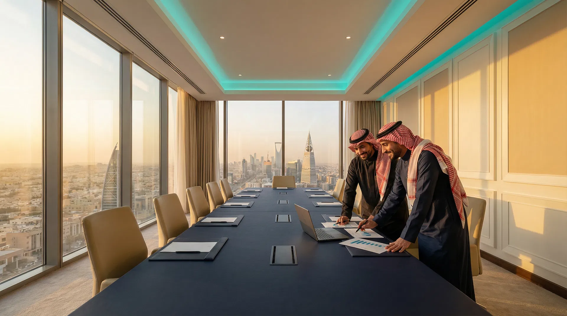
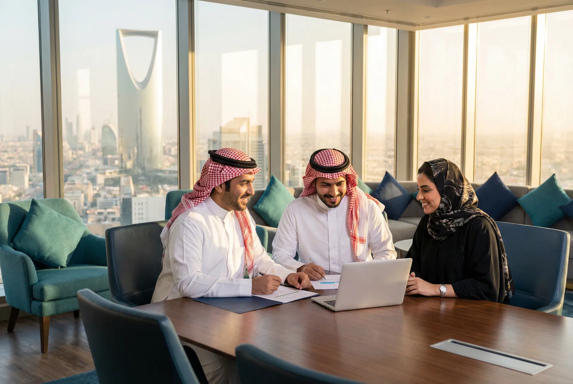
Saudi Business Professionals
Saudi men in white thobe and ghutrah, women in abaya, in modern boardrooms or high-rise offices. Riyadh skyline (Kingdom Tower) visible through floor-to-ceiling windows.
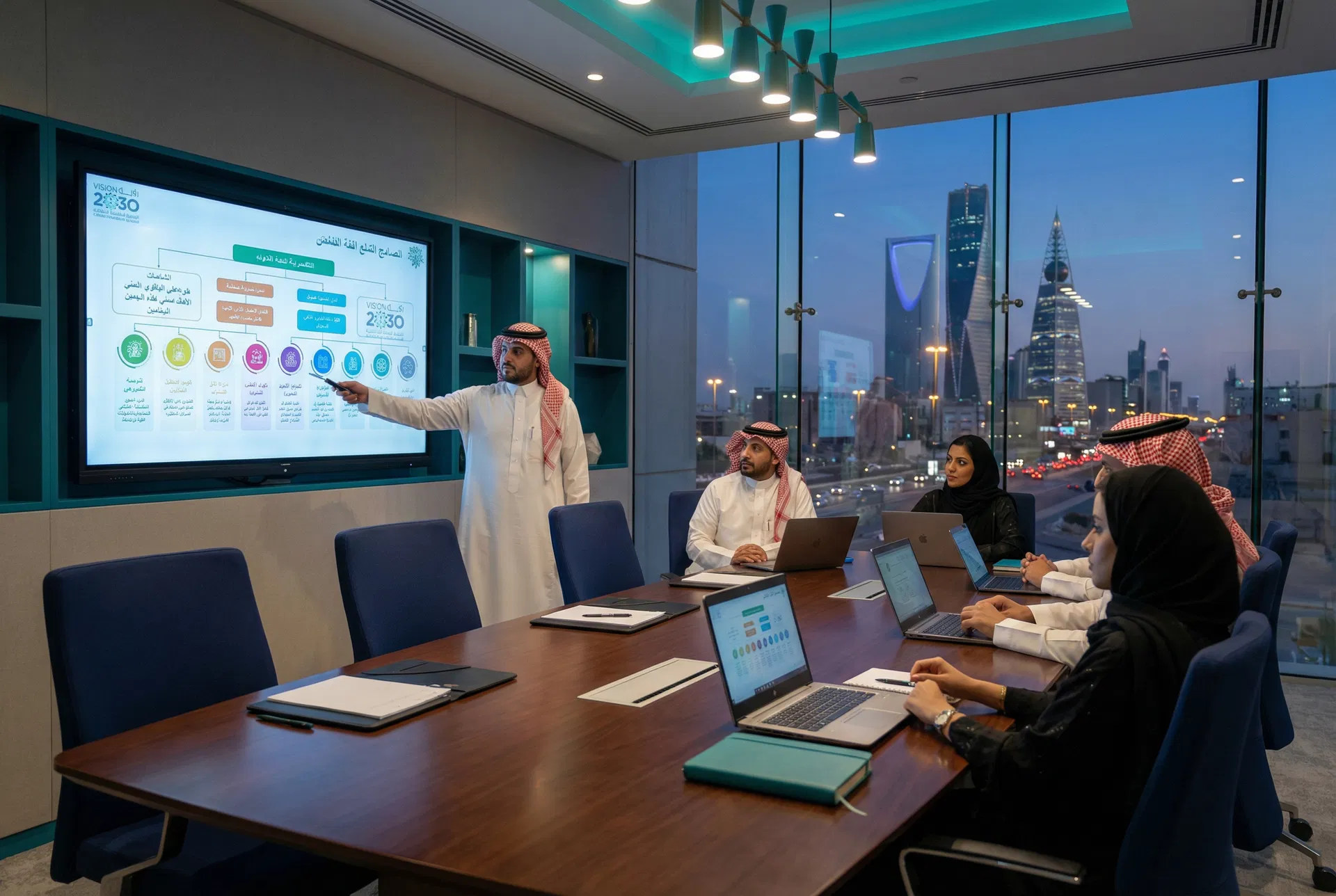
Strategy & Consulting
Presentation and strategy sessions showing Saudi professionals engaged in analysis, planning, and decision-making. Whiteboards, screens, and data visible.

Training & Human Capital
Workshop and training environments with Saudi learners. Energetic, forward-looking imagery that reflects the Training Center's mission of human capital development.
Collaborative Team Work
Saudi professionals (thobe and abaya) working together at a desk or meeting table. Expat colleagues may be included but Saudi dress remains the primary focus.
Partnership & Trust
Handshakes, collaborative moments, and client interactions that reflect Shuraka's core value of partnership. Saudi professionals preferred.
Innovation & Vision 2030
Technology, data, and digital transformation imagery that aligns with Saudi Vision 2030. Modern, aspirational, and forward-looking.
Colour Treatment
Apply a 20–35% Dark Navy (#343645) overlay on hero and full-bleed images. This integrates photography with the brand palette and ensures text legibility.
Apply a 15–25% Teal (#2BAC98) overlay for Business Services imagery. Creates brand cohesion and differentiates the sub-brand visually.
Apply a 15–25% Purple (#8C3F8B) overlay for Training Center imagery. Energetic and aspirational, aligned with the sub-brand identity.
What to Avoid
Generic Western stock photography with no Saudi or Middle Eastern context.
Images that do not reflect Saudi cultural norms, dress codes, or professional etiquette.
Low-resolution or pixelated photography. Minimum 1200px wide for digital; 300 DPI for print.
Heavily filtered, over-saturated, or stylised photography that conflicts with the brand palette.
Clip art, cartoons, or illustrated characters in place of photography.
Images with visible competitor logos, branding, or unrelated signage.
Staged, overly posed stock images that feel inauthentic or disconnected from the Saudi context.
Photography with dominant colours that clash with the brand palette (e.g., heavy reds, bright oranges).
11 — Brand Mockups
Real-World Applications
These mockups illustrate how the Shuraka Almustaqbal brand appears across physical and digital touchpoints. They serve as a reference for designers, printers, and production teams to ensure consistent brand expression.
Physical Items
shuraka.com.sa
FIRSTNAME LASTNAME
Job Title
Print — Physical
Business Card
- —85 × 55 mm standard size
- —Dark navy front, white back
- —Full-colour stacked logo on front
- —Matte lamination recommended
Merchandise — Physical
Branded Pen
- —Dark navy body with teal accent clip
- —White negative logo engraved or printed
- —Use horizontal logo variant only
Shuraka Almustaqbal
Merchandise — Physical
Branded Notebook
- —A5 size, dark navy cover
- —Embossed or foil-stamped icon on cover
- —Interior pages with subtle teal header rule
Merchandise — Physical
Tote Bag
- —Natural canvas or dark navy fabric
- —Centred stacked logo, screen printed or embroidered
- —Minimum logo height: 60mm
Digital Items
Digital — Social Media
LinkedIn Company Page Banner
- —1128 × 191 px recommended
- —Dark navy background with teal accent
- —Horizontal logo — negative (white) version
Digital — Social Media
Instagram Post Template
- —1080 × 1080 px (square) or 1080 × 1350 px (portrait)
- —Brand colours as background
- —Logo in corner at minimum clear space
Digital — Web
Website Navigation Bar
- —Dark navy header with white negative logo
- —Matches shuraka.com.sa current design
- —Logo links to homepage
Digital — Presentations
Presentation Slide
- —16:9 widescreen format
- —Dark navy title slide with teal accent
- —Horizontal negative logo in bottom-right corner
Signage & Environment
Print — Signage
Roll-Up Banner
- —800 × 2000 mm standard
- —Dark navy background
- —Stacked negative logo centred top
Riyadh Office
Print — Signage
Office Door Sign
- —A5 landscape format
- —White background, full-colour logo
- —Clear space rules apply
Merchandise — Apparel
Staff T-Shirt
- —Dark navy fabric
- —Embroidered or screen-printed icon on chest
- —Use icon-only or stacked negative variant
13 — Stationery
Stationery Applications
Consistent stationery reinforces the Shuraka brand at every professional touchpoint. Follow these specifications for all printed and digital correspondence materials.
Business Card
Front
shuraka.com.sa
Back
FIRSTNAME LASTNAME
Job Title
Letterhead — A4
A4 Preview
www.shuraka.com.sa
Logo Usage Note
The letterhead uses a white header — always use the Full Colour horizontal logo. Never place the negative (white) logo on a white background. If a dark header variant is needed, switch to the Negative (white) logo on a Dark Navy (#343645) header.
Email Signature
Preview
Implementation Note
Build the email signature as an HTML table for maximum email client compatibility. Do not use CSS flexbox in email HTML. Use the hosted CDN URL for the logo image to ensure it loads in all email clients including Outlook.
14 — Digital Usage
Digital Applications
Our digital presence must be as consistent and considered as our print materials. These guidelines cover social media, website, and digital advertising applications.
Social Media Profile Images
Use the icon-only S-mark on a Dark Navy (#343645) background for all social media profile images. Upload at minimum 400 × 400 px. The square format is compatible with all major platforms.
X (Twitter)
Snapchat
TikTok
Always use Dark Navy (#343645) background. Upload as PNG, minimum 400 × 400 px.
Download Profile ImageSocial Media Post Templates
Approved background and logo combinations for social media content.
Dark Navy — Main Logo
Teal — Business Services
Purple — Training Center
White — Full Colour
Social Media Image Specifications
Updated April 2026. Always verify with each platform's official help centre as specifications change frequently.
| Asset | Dimensions | Notes |
|---|---|---|
| Profile Photo | 400 × 400 px | Displays as circle; min 200×200px |
| Company Logo | 300 × 300 px | Square; PNG recommended |
| Company Cover | 1128 × 191 px | Landscape; max 4MB |
| Feed Post (landscape) | 1200 × 627 px | Ratio 1.91:1 |
| Feed Post (square) | 1080 × 1080 px | Ratio 1:1; recommended |
| Feed Post (portrait) | 1080 × 1350 px | Ratio 4:5 |
| Story / Document | 1080 × 1920 px | Ratio 9:16 |
| Asset | Dimensions | Notes |
|---|---|---|
| Profile Photo | 320 × 320 px | Displays as circle; upload 1080×1080px |
| Feed — Square | 1080 × 1080 px | Ratio 1:1; recommended |
| Feed — Portrait | 1080 × 1350 px | Ratio 4:5; max height in feed |
| Feed — Landscape | 1080 × 566 px | Ratio 1.91:1 |
| Reels Cover | 1080 × 1920 px | Ratio 9:16; safe zone centre |
| Story | 1080 × 1920 px | Ratio 9:16; keep text in centre 1080×1420px |
| Carousel | 1080 × 1080 px | All slides same dimensions |
X (Twitter)
| Asset | Dimensions | Notes |
|---|---|---|
| Profile Photo | 400 × 400 px | Displays as circle; max 2MB |
| Header / Banner | 1500 × 500 px | Ratio 3:1; max 5MB |
| Post — Landscape | 1600 × 900 px | Ratio 16:9; recommended |
| Post — Square | 1080 × 1080 px | Ratio 1:1 |
| Post — Portrait | 1080 × 1350 px | Ratio 4:5; max in feed |
| Asset | Dimensions | Notes |
|---|---|---|
| Profile Photo | 170 × 170 px | Displays as circle on desktop |
| Cover Photo | 820 × 312 px | Mobile: 640×360px; keep key content centred |
| Feed Post (square) | 1080 × 1080 px | Ratio 1:1; recommended |
| Feed Post (landscape) | 1200 × 630 px | Ratio 1.91:1 |
| Story | 1080 × 1920 px | Ratio 9:16; max 20MB |
| Reel | 1080 × 1920 px | Ratio 9:16; max 4GB |
Snapchat
| Asset | Dimensions | Notes |
|---|---|---|
| Profile Icon | 320 × 320 px | Displays as circle |
| Snap / Story | 1080 × 1920 px | Ratio 9:16; keep content in safe zone |
| Ad (Single Image) | 1080 × 1920 px | Ratio 9:16; max 5MB |
TikTok
| Asset | Dimensions | Notes |
|---|---|---|
| Profile Photo | 200 × 200 px | Displays as circle |
| Video (vertical) | 1080 × 1920 px | Ratio 9:16; recommended |
| Video (square) | 1080 × 1080 px | Ratio 1:1 |
| Video (landscape) | 1920 × 1080 px | Ratio 16:9 |
Website & Digital Guidelines
The following guidelines are aligned with the current Shuraka Almustaqbal website at www.shuraka.com.sa. All digital touchpoints should maintain this established visual language.
Website Header Reference
Navigation Logo
Use the horizontal Negative (white) logo in the dark navy navigation bar, left-aligned. This matches the current shuraka.com.sa header. Minimum height: 24px on web.
Favicon
Use the S-mark icon-only symbol as the website favicon. Provide 16×16, 32×32, and 192×192 px versions. The Dark Navy background version is preferred.
Colour on Screen
Use HEX values for all digital applications. Ensure minimum 4.5:1 contrast ratio for body text (WCAG AA). Dark Navy (#343645) on white meets this requirement.
Typography on Web
Load Josefin Sans via Google Fonts. Use weights 300, 400, 600, and 700. Minimum body font size: 16px. Line-height: 1.6 for body text. Letter-spacing: 0.05em for headings.
CTA Buttons
Primary CTA: Teal (#2BAC98) fill with white text. Secondary CTA: transparent with white border and white text (on dark backgrounds). Border radius: 0 (sharp corners).
Section Backgrounds
Alternate between Dark Navy (#343645) and White sections to create visual rhythm. Use the teal accent rule (1px) as a section divider. Avoid using purple as a full-page background.
Digital Ads
All digital advertising must include the logo, follow brand colour guidelines, and use Josefin Sans. Never use the logo at sizes smaller than 80px wide in digital ads.
Email Campaigns
Use the full-colour horizontal logo in email headers on white background. Maximum email width: 600px. Always include a plain-text fallback. Test across Outlook, Gmail, and Apple Mail.
Sub-Brand Digital Identity
Business Services
- — Primary accent: Teal #2BAC98
- — Secondary: Deep Teal #078B84
- — Use Business Services logo exclusively
- — Dark Navy backgrounds for premium feel
- — Tone: professional, strategic, confident
Training Center
- — Primary accent: Purple #8C3F8B
- — Secondary: Deep Purple #603060
- — Use Training Center logo exclusively
- — Energetic, aspirational imagery
- — Tone: encouraging, empowering, dynamic
15 — Layout & Composition
Layout Principles
Consistent layout and composition create a recognisable visual language across all brand materials. These principles guide how we structure content, use space, and create hierarchy in every communication.
Grid System
Print (A4)
Digital (Web)
Composition Principles
01
Hierarchy Through Scale
Create clear visual hierarchy by varying text sizes significantly. The relationship between display text, headings, and body should be immediately apparent.
02
Intentional White Space
White space is not empty space — it is a design element. Generous margins and padding signal confidence and quality. Never crowd elements together.
03
Consistent Alignment
Align all elements to the grid. Left-aligned text is preferred for body copy. Centred alignment is reserved for display headlines and pull quotes only.
04
Colour as Structure
Use colour blocks and backgrounds to create section breaks and visual rhythm. The transition from dark to light sections should feel intentional and purposeful.
Approved Layout Patterns
Full-width dark hero with teal accent rule
Two-column split: image left, content right
White content card with colour-coded service blocks
Dark section with teal vertical accent and grid cards
Full-width teal feature section (Business Services)
Purple Training Center section with yellow accent